This is the article the whole series was building toward. A reader opens the book and sees the sacred text and its reading at the same time, on facing pages, each aligned with the other. Making that happen is a design problem — the spread — and here is how to think about it.
New here? This is one article in a Gurugo Labs field series drawn from a client engagement to produce a traditional trilingual (Sanskrit · Tamil · English) devotional book — but it reads on its own. This article: how to design facing pages so two or three scripts sit side by side and a reader can move between them easily. Three terms you'll need: the recto is the right-hand page, the verso is the left-hand page, and the two seen together are a spread.
The unit of design is the spread, not the page
In everyday documents you think one page at a time. In a book meant to be read across two scripts, the real unit is the spread: the left and right pages a reader sees together when the book is open. Because the whole point is to show two languages at once, you design the left and right as a pair, not one after the other.
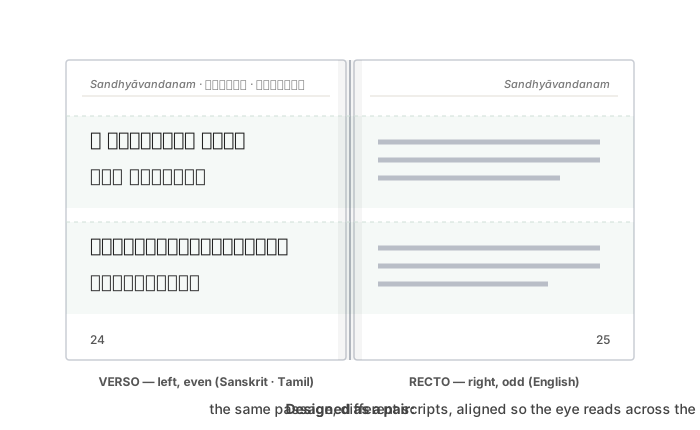
A little book anatomy makes this concrete. Books open to the right, and by long convention the first page of content is a right-hand page. Right-hand pages (recto) always carry odd numbers; left-hand pages (verso) always carry even ones. So a spread is always an even (left) page facing the next odd (right) page — page 24 facing page 25. That pairing is fixed, and it's the frame every facing-page decision lives inside.
Deciding what goes where
There are a few honest ways to place multiple scripts, and the choice shapes the reading experience.
One language per page (facing translation). Put the original scripts on one side of the spread and another language on the facing side. The reader takes in one page as "the source" and glances across for the other. This classic parallel-text layout keeps each page visually calm — one script system per page.
Stacked blocks on the same page. Put the scripts one above another in blocks — all the Sanskrit, then all the Tamil — so a reader sees a passage in each script in a single column. Kept as separate blocks (rather than alternating line by line), each script reads cleanly on its own terms.
Line-by-line interleaving. Alternate scripts line by line. This binds each line tightly to its counterpart, but it can feel busy and makes each individual script harder to read continuously.
There's no single right answer; there's a right answer for your reader. The important thing is to decide deliberately and apply it consistently across the whole book.
Alignment is the real work
Whatever arrangement you choose, the quality of a parallel text lives in alignment: corresponding passages should line up, so the eye can leave one script and find its counterpart without hunting. When verse three of the original sits at the top of the left page, verse three of the reading should sit at the top of the right.
This is genuinely hard, for a simple reason: the same passage takes different amounts of space in different scripts. A line of Devanagari, its Tamil transliteration, and its English rendering are rarely the same length or height. Left to flow naturally, they drift out of step, and by the bottom of the page the pairing has sheared apart. Keeping them aligned means treating the spread as a designed grid — deciding where each passage begins on both pages — rather than letting two independent streams of text fall where they may.
Why the pair must be built together
Because a spread is a designed pair, the two pages are coupled: a change on one side can throw off the alignment with the other. Add two lines to the left page and, if you're not careful, everything below shifts and no longer faces its counterpart on the right. This is the reflow problem from the layout article, now with higher stakes, because here alignment carries meaning. The defences are the ones a layout tool is built to give: master pages so every spread shares a structure, consistent frames so passages start in predictable places, and edits made with the pairing in mind.
How we solved it on the engagement
We designed the trilingual spread around a clear split: the verso (left page) carried the Sanskrit and Tamil, and the recto (right page) carried the English. Within the left page we kept Sanskrit and Tamil as separate stacked blocks rather than interleaving them line by line — a deliberate choice, because separate blocks let a reader follow either script cleanly without the other breaking its flow, which matters for a text meant to be recited.
We carried that structure into the running headers, and this is where automation earned its keep. The header on each recto named the section in English; the header on each verso named it in Sanskrit and Tamil — and, crucially, a left page's header had to name the section shown on its facing right page, not wherever the left page's own text happened to fall. Rather than set hundreds of headers by hand and keep that facing-page relationship straight manually, we generated the running headers programmatically from the book's own heading structure, so every spread's header pair stayed correct and consistent even as content shifted. The layout tool gave us stable frames and master pages for alignment; scripting gave us headers that were right by construction.
⚙️ For the hands-on reader
- Fix the spread's structure on master pages: matching margins and frame positions on every verso and every recto, so passages start in the same places.
- Align by passage, not by line-count — decide where each verse begins on both pages, rather than hoping two streams stay level.
- Keep scripts as separate blocks unless line-by-line pairing genuinely serves the reader; separate blocks read more cleanly.
- Make the running header of a left page name the section shown on its facing right page, so the pair is consistent even at a page turn.
- When content changes, re-check alignment across the whole affected spread, not just the page you edited.
Takeaways
- The unit of design is the spread (facing verso + recto), not the single page — design the pair together.
- Books open right; recto = right = odd, verso = left = even; a spread is always an even page facing the next odd page.
- Choose a placement deliberately — facing translation, stacked blocks, or interleaved — and apply it consistently.
- Alignment is the real work, because the same passage occupies different space in each script; treat the spread as a grid.
- Protect alignment with master pages and consistent frames, and consider generating running headers so facing-page relationships stay correct.